 A while ago I posted a link to an interesting review of Josh Simmon's haunting wordless graphic novel House which digressed into a brief but enlightening academic discussion of the link between comics and architecture. Although Mazzuchelli was mentioned in this article it was a very fleeting mention, which is surprising given the relevance he holds with the argument. A lot of Mazzuchelli's work thus far (notably Batman Year One and ESPECIALLY his claustrophobic and innovative adaptation of Paul Auster's City of Glass) have explored space in a unique way. Asterios Polyp, his first original graphic novel is no exception.
 But the fact that Asterios, the books protagonist, is an architect, is not the thing that makes this work immediately architectural. In the true style of some of the greats of architecture such as Miles Van Der Rohe in this graphic novel form follows function.
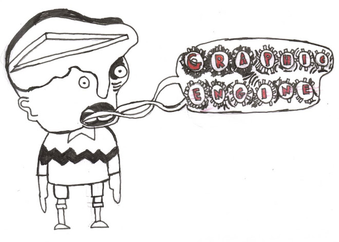
The experimentation with panels, word balloons, and splash pages is daring and bold at times, but NEVER at the expense of the story. In fact I would go as far as to say that I have not seen as perfect pacing in a comic as within the pages of this graphic novel. Where a panel is meant to be a punch, it truly packs a punch. You can feel it as a punctuation mark, as an overwhelming full stop. Everything adds up to the whole. Be it the different type faces, the limited and unusual colour palette (purples, blues, pinks, and yellows) or the overlapping of different drawing styles (from straight laced cartooning to pure abstraction), none of it takes away from the feel of the thing.
 Mazzuchelli appropriately channels Saul Stienberg, a boundary skipping artist with a taste for the architectural. He presents people broken down into geometrical shapes, rough sketchy shading, even made entirely out of letters. It is in these moments that the visual does well to represent two people coming together, falling apart, working out differences, or allowing themselves to become vulnerable. In his more sketchy moments which are mostly wordless abstract and full of myth, symbolism, ugly surrealism, he evokes both French artist Blutch and the wordless woodcut novels of Frans Masereel and Lyn Ward (whose work often involved being swallowed up by the big city).
Scratch under the surface of this work and you have a relatively simple story, a simple relationship trope. But simple layers are added to the story such as musings on Asterio's lost twin, his constant referral to the academic world, and the introduction of jealousy into the relationship.
The Yin and Yang of Asterois and his wife/ex-wife Hanna is a chaotic balance of forms, the differences that somehow hold them together best represented by their opposing obsessions within architecture and sculpture. His is a reliance on straight lines and cold-hearted logic and analysis (although he does deceive himself at times) and hers is more about the freedom of form feelings and intuition.
Asterois uses his academic dissection of the arts as an attempt to explain human behaviour, mainly his own, through diagrams and references. It is this arrogance that quickly becomes short-sightedness.
Of course this does sadly represent the standard binary biased view of gender(*1) but Mazzuchelli does not represent Hanna as irrational and lacking control because of this, ultimately it is Asterios who has the most to lose from his behaviour.
The comparison to Yin and Yang is an appropriate one to sum up my feelings on this graphic novel. It takes a truly great comic book artist to make a graphic novel that works equally well on the written level as well as the visual level. Every element of the story is in perfect balance, the words become pictures, the pictures become words, everything is naturally interwoven. The storytelling consists of a simple thread with multiple complex threads running off of it, the style perfectly suits the characters(*2), the mood, and the pace. Another image that runs throughout the book is that of the clock or watch, often Swiss and efficient. So would it be safe to call Asterio's Polyp the Ikea of graphic novels? Well yes, but then I'd say it's a bit easier to put together than your average flat pack desk.

--------------------------------------------------------------------------------------------------------
(*1) For a much more articulate examination of these ideas, including how the visual in Aesterio's Polyp reinforces certain stereotypes, you can't go far wrong reading this. Personally I think Mazzuchelli uses these visual binaries to express the limitations of acting according to apparently ingrained gender behaviour.
(*2) Asterios's sharp angular head versus Hanna's curvy doe-eyed bean head.


No comments:
Post a Comment