Thursday 14 October 2010

Review: House-Josh Simmons

SPOILER ALERT!

Inspired by the article I posted a link to about comics and architecture, I recently bought a copy of Josh Simmon's wordless graphic novel House. Being wordless you'll read this in about five minutes, but just because its easy to digest doesn't mean it isn't worthwhile. In fact the decision to make this a wordless graphic novel has certainly weighed in Simmons favour. All the tension, the atmosphere, every last nuance is achieved perfectly without having to resort to a single word balloon or caption explaining the situation. House starts off like a slightly more grown up children's adventure/buddy movie (see The Goonies, or even traces of Stand By Me) as three teenage friends meet up to explore an abandoned mansion in the woods. We get subtle hints at a budding romance, and sparks of jealously alongside beautifully rendered structures (that old cliche of beauty: urban decay) that at times seem like fantastic other worlds (for example the scene where they find a lake littered with the sunken corpses of other houses). Soon however the atmosphere changes. I make the cinematic link because House reads like a skillfully rendered storyboard to a very successful horror movie. As a fan of horror films whose occasional inability to empathise with characters makes it difficult for them to feel fear (except of the unknown jumps and starts that litter any film) I know House does a good job because it manages to make me feel the teenager's fear, their claustrophobia, their eventual hopelessness, all without the aid of a tension building soundtrack. That old mantra 'it's what you can't see that scares you' is pretty well suited here.

It is similar in a vein to Spanish horror film REC or a less hyperbolic Saw. It manages to make me wonder how I would cope in the same situation, the ultimate compliment for any horror film/comic. The eventual engulfing of the black panel borders onto the images themselves represents the fading light of life and hope in the situation, the desperation, the claustraphobic element of their surroundings. A partial blur of an unkown figure seen by the boy who has lost is glasses is also a nice touch. The ending comes as a twist, it is a rare thing in a horror movie (especially where a teenage cast is concerned) that no one survives, but this is the shocking power of House, and the fact that they mysterious forces at work in the mansion are never revealed is also another teasing and tantalising touch. A perfectly chilling read!

Wednesday 13 October 2010

Blog of the week: Avoid The Future

Avoid The Future is an incredibly well designed blog 'based on a secret island fortress somewhere between the UK and France' (taken from the about us section of the site). It's great to see a blog that not only seems to have its finger on the pulse of the international small press scene but it also nice to look at too. The writers at ATF wade through the yards and yards of juvenile crap you often find at a comic convention (big breasted super heroines a go-go) to bring you the tastiest looking treats which tell me I've still got a way to go when it comes to knowing my shit about small press comics. But I'm not proud, I'm glad that ATF are out there to fill in the gaps in my knowledge and introduce me to stuff I may have otherwise never found on my own. They also review and interview indie heavy weights such as James Kochalka and Johnny Ryan as well as industry professionals (they seem to have pretty good links with Toronoto based Koyama Press) and comic book shop owners. Their interviews seem pretty well researched, in-depth, and yet with a touch of playful irreverence. Their latest batch of one question interviews will introduce you to a world of lesser known artists and interesting sounding projects (such as a Tintin sketchbook and probably the only appealing comic from Slave Labour Graphics* that's ever caught my eye-Pinocchio: Vampire Slayer). Check out ATF here.

----------------------------------------------------------------------------------------
*Slave Labour Graphics are notorious for some pretty cringe worthy goth themed comics

Webcomic of note #1


Jin and Jam No 1-Hellen Jo

Comic artist Jordan Crane's website What Things Do is a haven for reading good comics online. He's made available early Yeast Hoist stuff by Ron Rege Jr, a bunch of Sammy Harkham strips, the entirety of his own graphic novel The Clouds Above, and much more besides. He also has a news/blog roll that runs alongside it.
The latest edition to the site is a fantastic hybridisation of manga and American comics and Calafornia culture, Jin and Jam by Hellen Jo. It straddles that line between East and West precisely because Jo was born in America and considers America her home, but is also Asian. Artistically it sits somewhere between Jillian Tamaki's artwork for the graphic novel Skim (especially with the large chins of her characters) and the grotesque surrealism of Taiyo Matsumoto (she quotes Black and White at the beginning of the comic). The addition of a cat fight with con-joined twins is certainly very reminiscent of Matsumoto (as well as Charles Burns and the kind of off the wall characters you'd find in Jim Rugg's Afrodisiac). Traces of oriental folk art and art nouveau burst through in some of the details, such as the twins hair during the fight scene. This comic is violent and stupid, but also warms your heart ever so slightly. It makes us remember that the people worth talking to, the people worth hanging out with, aren't really the popular ones, but the outsiders, the ones who don't really fit in anywhere, and thus bind together, and generally have more fun. Whereas Skim by Jillian and Mariko Tamaki also deals with outsiders, and the superficiality and shallowness of school life, it is a great deal more angst ridden whereas Jin and Jan seems carefree and optimistic, ready to face the new adventure of adult life, but in no rush to leave the current adventure just yet. I liked Jim and Jan so much I bought it, reckoning it would be a nice thing to own in print/hard copy (the cover and end pages are finished with great watercolours).
View Hellen's site here.

Tuesday 12 October 2010

Book cover of the week

This weeks book cover of the week is a very special one as I will be looking at the book as an entire package. The book in question is the David Hughes illustrated version of Victor Hugo's The Hunchback of Notre Dame. David Hughes is a British illustrator and artist who has recently had published his own unusual graphic novel entitled Walking The Dog, as well as illustrated the children's book Strat and Chatto by Jan Mark. Coming across like a less heavy handed Steadman, with lovely thin line work and a keen eye for the grotesque, Hughes uses collage, photographs, and comics in between the text of the novel. Hughes's illustrations are at times deliberately stripped down and naive reminding me almost of the kind of diagrams and maps of mysterious worlds you would create as a child. Hughes's over-sized lettering and the overlapping of the silver, grey, and collaged backgrounds is very interesting (and at times gives the appropriate effect of the kind of brass rubbings you would do in a church). Overall a fantastic package and although I have not read through it yet I have every confidence that the reading of the pictures will not interrupt the flow of the words in the slightest. Unfortunately you'll have to take my word for it and go out and buy it, as it' very difficult to scan any high quality images from inside the book. Check out Hughes's site here.

Sunday 10 October 2010

Latest comic events

Here's some worthwhile comic events happening in the next month:

That's Novel! Exhibition at London Print Studio. 22nd Oct-18th December

Following the huge success of the Hypercomics exhibition ( which was Time Out's exhibition of the week, and got a pretty rave review from Canadian comics critic Bart Beaty) Paul Gravett is curating what will no doubt be another fantastic exhibition entitled That's Novel! Featuring work from international stars like Ho Che Anderson (artist and author behind the Martin Luther King graphic biography) and Robert Kirkman (The Walking Dead) as well as members of the British small press scene Paul Rainey, Savage Pencil, Darryl Cunningham, Philippa Rice, etc
Also featuring work from the artists of illustration/comics publisher Nobrow and a first chance to see the work of Argentian artist Carlos Nine. Like Hypercomics this exhibition will also be free!

Paul Gravett hosts comics panel at DSC South Asian Literature Festival. Sat Oct 23rd. Q Forum, London. 7pm


Paul Gravett will be hosting a panel discussion called A Visual Renaissance: The Rise of Graphic Novels in South Asia. Joining him on the panel will be Mustashrik who was the artist for Julius Ceaser for SelfMadeHero's Manga Shakesphere line as well as being a very successful commercial artist in his own right, working with Coca Cola, Stella Artois and The Department for Transport.
Also joining him and representing the small press scene will be Kripa Joshi a former graduate of New York's School of Visual Arts from Nepal whose folk art inspired comic adventures of Miss Motti are available for purchase in Gosh Comics and The Cartoon Museum in London. Finally the third panellist will be British talent and author of Rumble Strip Woodrow Phoenix, who visited India last November through The British Council to lead comics workshop, meet graphic novelists, and check out the current comic scene (lucky git!). The panel will be held at Q Forum, and tickets will cost £8 including drinks.

Melinda Gebbe @ Laydeez Do Comics Monday 25th October The Rag Factory, Brick Lane, London. 6.30pm-9.30pm

Having immensely enjoyed the atmosphere of their last meeting, a special talk given by underground comix legend Trina Robbins, I look forward to taking the trip up to London again this month. This months meeting returns to its usual multi-speaker format but is headed by another pioneering figure in the wimmin's comix movement, Melinda Gebbe, who is now based in Nottingham with husband Alan Moore with whom she collaborated on the jaw-dropping three volume ode to Victorian porn and childhood fairy tales, Lost Girls. Also speaking will be Lisa Gornick, a London based filmmaker who keeps a blog of daily drawings about her film making, Sina Shamsavari, an autobiographical comic artist currently doing a PhD about queer alternative comics at Goldsmiths in London, and artist Michael O'Mahony. It costs a measly £1.50 to get in and you get free homemade cookies in the bargain, plus you're welcome to join them for curry in brick lane afterwards.

Spice Arthur 702. Live manga storytelling with instrumental accompaniment. 26th October. Soho Theater, Dean Street, London. 8pm.


A modern take on the traditional Japanese art form of picture storytelling Kamishibai which gave birth to Manga as we know it today. Although this is all in Japanese, an English synopsis will be provided for each tale, and the combination of crazy voices, sound effects, and trumpet and drum accompaniment should make this an exciting and once in a lifetime event. Click here to view a YouTube video of the group in action.

Thought Bubble Leeds & Women In Comics Conference II. 18th November. Leeds Art Gallery, Lecture Theater, Henry Moore Room. 10.30am-5pm.

As part of the annual Thought Bubble sequential art festival in Leeds which takes place between the 18th and the 21st of November, there will be an all day academic conference concerning the role of women in the comics industry, and the representation of women in comics, amongst other things. The guest speaker of the conference will be Suzy Varty who published the first all women comic in the UK (Heroine) in 1977. Email i.hague@chi.ac.uk for tickets. For more information of the rest of the Thought Bubble events click here.

Friday 8 October 2010

Review: Disrepute & Fear Of Failure #1-Ian Williams/Thom Ferrier

I love receiving post, especially when you get something you weren't entirely expecting. When Ian Williams (a.k.a Thom Ferrier) asked me to review his mini-comic Fear Of Failure, little did I know that I'd get another one of his comics thrown into the bargain. It is actually this added extra that impressed me more than the original comic sent for review (not that I didn't like it, but I'll get to that later). It's always nice to see real love and craftsmanship go into a comic, ingenuity, and a clever creative twist are always welcome in eyes, and Disrepute (the name of the bonus comic in question) certainly pulls out all the stops. Handmade, hand numbered, bound with string instead of staples, and printed on lovely pulpy paper, the cover of the comic has rather cleverly been made to look like the folder for a patients medical notes. The end pages of the comic contain stories that fold outwards to reveal more, and there is a nice mix of stories that are read horizontally and ones that have to be read vertically. The whole design feel of this comic, as well as the fact that at times Williams will try and fit as many panels into a page as possible, cause me to liken this comic to Chris Ware (especially his Acme Novelty books). So even before I get into the content of the comic I'm smiling. 
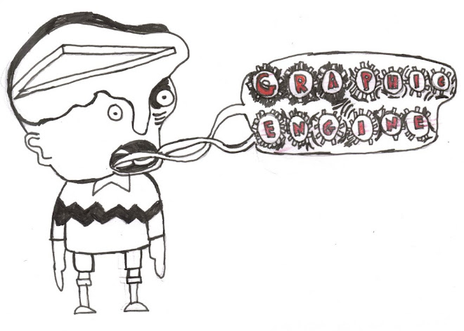
Luckily the stories within this comic do the layout justice. Although the small print tells us that these are fictional tales of fictional people you can tell that William's own experiences have seeped through into these pages. It is easy to see how William's can call himself an authority on Graphic Medicine (the whole site/idea of Graphic Medicine was William's conception).

It is refreshing to see things from a Doctor's eye view rather than from the side of the patient for a change. In medical narrative graphic novels the doctors have often been background figures, simply there to represent the treatment taking place (although notably Pekar's doctor in Our Cancer Year does take an interest in the whole comics process and forms a closer than usual doctor patient bond). But this is slowly changing, there are now a small rash of comics coming out that are telling us that even the health care professional who is supposed to be unbiased, unemotional, and unbreakable, can be vulnerable, judgemental, and shockingly, human. Williams does this perfectly by showing how his alter ego's childhood anxieties follow him into his adult and professional life (it seems weird to think of a doctor who grows faint at the sight of blood, but I'm sure they're out there). Elsewhere we see how Dr Ferrier maintains his sanity when faced with particularly troublesome patients, and how sometimes his desire to care is outweighed by his desire to be left alone. He addresses questionable ethical practices, is honest about some of his less favourable motives for becoming a doctor, and shows us that in order to be doctor you have to appear tough and emotionless on the outside but on the inside this isn't always that case. This comic would probably be a breath air to any medical student or indeed any health care professional right now, it might let them know they are not alone.
Fear of Failure is more like a doctor themed soap opera except it replaces the unlikely story lines and melodrama (save for the reappearance of Lois's mother who looks slightly vampish, like camp goth icon El Vira) with a distinctly British dry sardonic wit and a slightly wishful cool (a female doctor who wears a Sonic Youth t-shirt is a bit of a fantasy/wet dream for certain hipster types out there no doubt). This time around there is even less in depth focus on the patients (except for a patient with some unsettling yet amusing anecdotes about his neighbours cats, apparently inspired by a real life encounter) but at the same time there isn't a huge focus on the life as a doctor side of things either. Instead we get treated to the personal life of Dr Lois Pritchard, her ex-coal miner father, feelings of childhood guilt, and the soul crushing world of office politics that she must contend with in order to maintain a level of professionalism. It is clear also that the job does affect her, from the small snippets we get of her diary, and from the persistence of surreal nightmares. We get more subtle hints of her day to day strain through a secession of small restrictive silent panels inter splicing close ups of various patients ills with her reactions. There is subtle comedy at work too, for example when she leaves her Dictaphone on when interrupted mid dictation and bitches about a work colleague, her secetary finds the message later when she dictates it. Little clues are dotted throughout the comic as to the conclusion of the issue, and similar to a soap opera or a murder mystery program on television we start at the end with the vital facts omitted until the full extent of the facts are revealed again at the end (although of course we are left with a cliff hanger). All these are quite interesting and well executed storytelling techniques to employ in a comic. With Fear Of Failure it took me a couple of re-reads to appreciate the various nuances, although the feeling of it being a bit like a soap opera was still nagging away in the background. The character of Lois Pritchard is essentially cut from the same cloth as William's alter ego Dr.Ferrier: cold, distant, angry, yet anxious and vulnerable, and I'm sure both of them are characters that actual doctors can easily relate to. However, there was something much more real about the stories in Disrepute, maybe because it seemed like thinly veiled autobiography, and autobiography can be a useful, even life-affirming, tool in the right hands.
I see this as a very minor bone of contention and think that Ian Williams has really got his eye on the ball when it comes to the marriage of medicine and comics and I hope that he continues to produce comics, as well run his fantastic site Graphic Medicine, far into the future.

Saturday 2 October 2010

Review:Cat-B Kliban

Cat by B.Kliban is the perfect little gift book for the cat lover and in fact back in 1975 sparked an entire merchandising and publishing phenomena. Without B.Kliban's unusual cat cartoons we may not have the New Yorker cat cartoons and calenders, and we certainly wouldn't have Jeffery Brown's 'Cat Getting Out Of A Paper Bag'. B. Kliban's cat cartoons are far superior to Brown's, as well as being obviously affectionate, they are absurd and surreal, and seem to really get at the essence of mystery that is our feline friend. He also sums up my feelings about cats perfectly in this, the first picture in the collection:

My previous cat experience was with an understandably disgruntled three legged cat (who was made worse by my little brothers cruel streak) who I was afraid to walk past barefoot down the stairs. As a result of this I've always been more of a dog person until recently, which is probably why I enjoy this book so much.

The pictures in here remind me of the silly voice a friend of mine would put on whenever they saw a cat, of the imagined situations and personalities she would instill them with. The process of anthropomorphism here is a deceptively simple one here, it's all in the eyes: two simple circles with slight variations that symbolise annoyance, surprise, curiosity, and a whole host of other emotions. Kliban's cats aren't idealised either, you can tell he loves them for all their traits, even the less desirable ones. This is defiantly more in depth then the cliched poster of a kitten hanging from a tree branch. Kliban's nonsense cat language is also delightful, with a range of cats sounds you've probably never heard but at the same time don't seem entirely unlikely (wacka wacka and honk honk are among my favourites). If you own or like cats each picture in this collection will make you laugh out loud, and if you don't laugh out loud you probably have a lump of coal where your heart should be. The special bond between an owner and their cat (as well as the obvious question when it comes to cats: who owns who?) is described here with a very subtle and sparing use of words. It is the visual rather than the verbal pun that triumphs here (catchup. pursey cat, cat eyes etc). Dedicated with love to his own cats (who he draws in a more realistic manner throughout the collection), by the end of the book you get a real feel for cats not with a human personality but with something in between human and animal, something unique, something cat. Purrfect (sorry, I couldn't resist).


Friday 1 October 2010

Solipsistic Pop out in November!

I'm a little late off the bat with this one but the next issue of the brilliant UK Small Press anthology edited by Tom Humberstone is due in November. Expect great things because as a finely printed package Solipsistic Pop has kept on improving and this time around you can expect an A3 Poster and set of stickers by My Cardboard Life creator Phillipa Rice as well as a free Solipsistic Pop pencil for you to create your own comic with. This free gift goes nicely with the cover of the anthology by Marc Ellerby which is a mock up cover of Britain's beloved Beano. The anthology features the usual host of talents including Adam Cadwell, Anna Saunders, Stephen Collins, Mark Oliver etc with some tasty looking strips from Sol Pop first timers Rob Davis, Edward Ross, David O'Connel, and Warwick Johnson Cadwell. And the colour theme for this issue is: black and Pantone 485 U (a kind of Magenta/Red)

Keep your eyes peeled on the Sol Pop site here, there will be a launch party in November along with a children's comics workshop in early November. It is also available to pre-order on the site and is limited to a 500 print run.

Review: Digesting The Child Within-John Callahan


'John Callahan is no ordinary cartoonist' starts the brief introduction to this book. The idea of any cartoonist being ordinary is quite a laughable one to me. Comics (or at least the type of comics I'm partial to) are usually the venting of the guilty, the repressed, and the downright neurotic. Callahan certainly ticks all the alternative comic artist boxes in this sense, and gets extra brownie points for a difficult and religious upbringing (it seems one of the key ingredients in some of the best comic artists out there-Crumb, Justin Green etc, is Catholic guilt). Not only this but Callahan was an alcoholic at 12 and a quadriplegic at the age of 21. My friend commented that he was one of those people who couldn't t draw but who gets away with it because of the humour inherent in their work. Now whether or not Callahan could draw before his car accident, I can't be sure, I do know that cartooning was something that he came back to almost as part of his recovery process from alcoholism. But it is not entirely a deliberate primitive style on his part but actually because he can't move all his fingers and has to use his left arm to guide his right when drawing, although in my opinion it does add to the overall effect.


Callahan's gag cartoons to me epitomise the phrase 'gallows humour'. Instead of drawing cartoons and attaching words about how hard his life is and was, Callahan doesn't play the victim, and lampoons everyone and everything he can. Even though his cartoons are not about him you can tell he pours himself into them, and you can tell that the humour he adopts is cathartic, his own personal way of dealing with his lot. It is refreshing to see someone with a disability laugh at themselves, reminding us not to be too oversensitive, and indeed that laughter is the best medicines. But he doesn't just laugh at himself. no stones are left unturned: from cocaine addicts ('It doesn't seem like Christmas without snow') to schizophrenics and people in L.A. These cartoons are like the politically incorrect evil twin of the classic New Yorker gag cartoon, or better yet Johnny Ryan with brains. Even the cartoons without captions, even though they are crude, are remarkably easy to decipher and instantly hilarious (see below).

Deceptively simple, twisted, but not without a message, Callahan (who sadly died this year) was an innovative master of his craft and an inspiration for many (as the accolades from Matt Groening, Gary Larson, and Don Martin on the back of the book show). Having read this small collection I feel inspired to go out and get his best selling illustrated autobiography 'Don't worry, He won't get far on foot' which I can imagine will contain as much wit and perseverance as the drawings in this collection.

Jim Woodring accepts Genius award for Literature from The Stranger..

Jim Woodring creator of the surreal and wordless strip Frank has just accepted a Genius award for Literature from free Seattle based arts and culture newspaper The Stranger. Of course some people have taken offence to the fact that not only is he a comic artist(*1), but there are no actual words in his books! So how can it be literature?

Woodring himself addressed this pretty well in his acceptance speech, which you can read here.

------------------------------------------------------------------------------------------------
(*1) I'd like to think this is a view that is on it's way out, the recent spout of good reviews for graphic novels worldwide shows that the world is ready to accept that comics can be literature too.